AskSimple
Period
Sep 16 to Jan 17
Role
Team member
Project Scope
AskSimple solves the need of shy students to be able to ask questions in class without the fear of getting embarrassed. Also, the concept fosters class participation in general and might encourage more unmotivated students to participate and be interested in class topics again.

Needfinding
We were given the task of finding problems faced in the education sector. Narrowing it down to frustrations faced by students, we decided that these frustrations should be similar across borders. We interviewed 8 students across 5 different countries, cultures, and course specializations.
Classes are not only taught in physical classrooms anymore, online alternatives also exist. One might even say that physical classrooms are starting to move towards classes exclusively taught online, due to scalability and convenience. These online classrooms are not fully mature yet and might bring even more frustrations to students and teachers, which is why we also want to explore this part of our studio theme using contextual inquiries.
"What do you find frustrating in the classroom?"
The 3 big questions we wanted to know were:
- "What do you find frustrating in the classroom?"
- "What would you like to change if you think about previous classroom experiences?"
- "What do you like about the interaction between you and the teacher?"
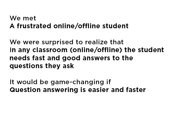
Initial POV
Based on our interviews with students, we identified the following initial point of view:
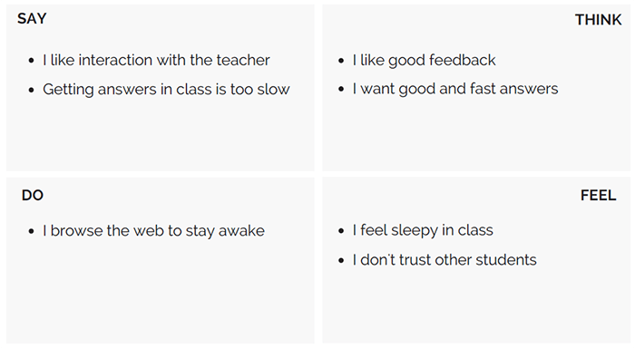
We noticed that both students who took both types of classes or just one type have a common frustration. We conducted additional needfinding based on this point of view. We also focused our new interview questions on bringing online and offline classes together, since both types of students have more or less the same frustrations in a different context. To understand our findings, we translated the things mentioned by our users to an empathy map:
Additional Needfinding
We noticed that both students who took both types of classes or just one type have a common frustration. We conducted additional needfinding based on this point of view. We also focused our new interview questions on bringing online and offline classes together, since both types of students have more or less the same frustrations in a different context.
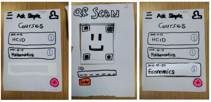
Low-fi Prototype
Enter a classroom:
If a user wants to enter a new course, the “+” button is clicked, scan the QR code provided in class or enter an ID and then the course will be added to the course list.
Navigation:
Users can navigate in the order: Choose a course -> choose a session -> choose a question.
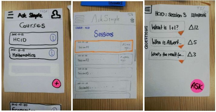
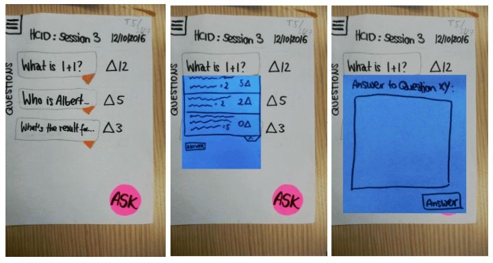
Ask a question:
Click on the “Ask” button, enter a question in the pop-up text field and submit the question. A “Thanks for asking” message will appear and the question will appear in the question list.
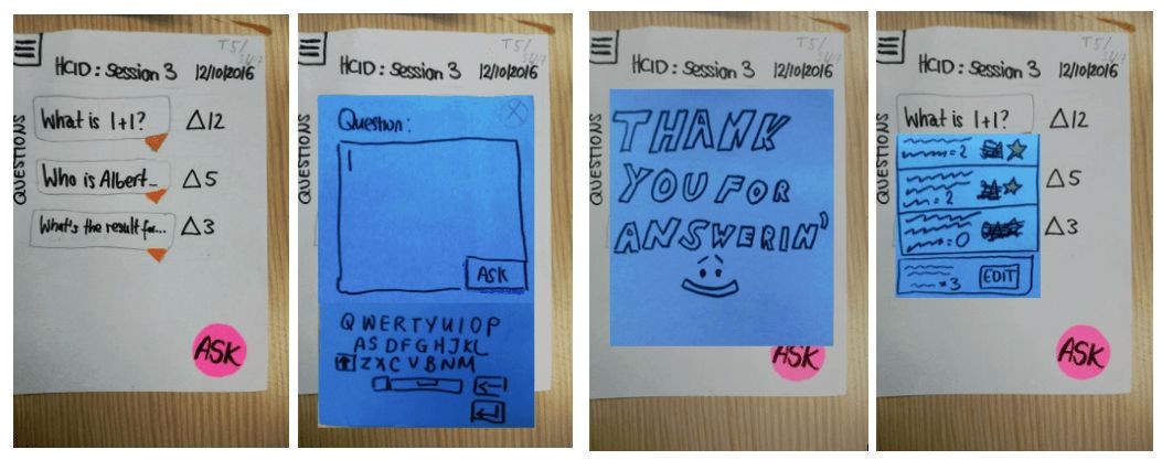
Answer a question:
The arrow “v” below the question is clicked to open all answers to the question. Click on answer opens a pop-up text field, Click on submit adds the answer to the answer list.
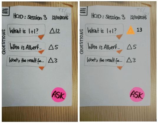
Upvote a question:
To upvote a question, user clicks on the triangle sign. To redo the action, the triangle is clicked again.
Concept Video
To better illustrate the above actions, we created a video to show how the app can be used in a lecture theatre.
User Testing
We found 3 random students from the dorm to try out our low-fi prototype. We cannot test the prototype in a real setting, so we got the next best thing; we simulated a classroom session in a small room with tables and chairs. During the testing, we have a person tells the scenario, and another person as 'The computer' who switches the paper screens when the user interacts with the prototype. Two other people were observing and recording down what they hear and saw from the user. We have qualitative measures, that consists of observations of mistakes. Mistakes are defined as pushing something with the wrong assumption. Another thing is when the test participant is wanting to do something, but could not because it was not in the prototype. We noted that down as possible major points of improvements. Our other test measure is a quantitative measure: the time to complete a task.
Thanks to the testing of the paper prototype, we were able to find out about several bugs that our first paper prototype carries, certain issues that were unclear to the testing participants as well as several ideas that the participants had concerning the improvement of the app. Each tasks was completed within 3 minutes, which is fast enough. They should not spend more that 5 minutes on each tasks, as our value proposition is asking made simple, so every participant met those quantitative expectations.
Discussion on the user testing
We gained many learnings from the testing of our prototype. First of all, we learned that it is difficult to take all ways of usages into account as a designer. Our test participants suggested many basic functionalities which sounded logical to include. However, some suggestions were clearly personal preferences. We have to think carefully about these suggestions, as we cannot respond to everyone’s needs and preferences in one app. However, we will try to respond to the preferences of the majority.
A clear fault in our design was a button that was clickable, but was not seen as clickable (upvote button). On the other hand, a button that was not clickable, was seen as clickable (approved sign for questions). For these cases we decided to change the buttons into something that is more obvious to their intended functions. We did the same for any other unclear functions in our design that were pointed out.
Furthermore, we simply forgot many of the basic functionalities, like e.g. a basic logout function. Even if not everyone wants to logout the app, and rather stay logged in the app, we agreed that the option should be there. After each test, several of those basic functionalities were added.
Another improvement was in the complicated process regarding the notification of receiving an answer to a questions you asked. Clicking through the app to reach the answer took too much time, so we simplified it. Although it was not in our three tasks,we considered it still an important part of our design.
Our testing did not reveal anything regarding how the TA and teacher is using our application. Both interfaces are showing the students’ part of the app, however some functionalities need to be different. For example, teachers can make sessions, but can’t upvote questions. Both the TA and teacher have the ability to approve answers, and possibly moderate the questions/answers. In the following process, we will have to decide if we will create the TA/teacher interface and how it will be designed.