Thread Paradise
Period
Jan to Apr 17
Role
Team member
Project Scope
To find out the needs of Singaporean shoppers, based on the assumption that males and females have different shopping behaviours and culture, and implement design changes to solve the problems.

The Issue
Based on the issues faced by Singaporean shoppers on Singapore-based eCommerce apps, could we find any major issues that frustrates a shopper enough for him to not purchase an item? We first started the project by conducting multiple needfeeding sessions with 20 young adults. What we found out were issues linked to sizing issues. There were a couple of issues faced by users:
- Inconsistent clothes sizing charts
- Clothing does not fit user perfectly
- Lack of relevant reviews
- Hard to compare different clothes
- Hard to judge the quality due to unhelpful photographs
Due to these reasons, the people we talked to choose to go down to a store personally.
Other considerations
There were a couple of points that we picked up and helped shape the way we design the app as well:
- From most to least important: Design, Price, Size, Colour, Brand
- Filters used most to least often: Price, Size, Brand, User Rating, Colour
- Size format most to least preferred: (XS, S, M, L), (175/70, 175/80), (170, 175)
We aim to find solutions to alleviate these problems by enhancing online shopping experience. These solution ideas should also be easily integrated into any existing shopping app.
How we approach these problems
Measurement record and size guide
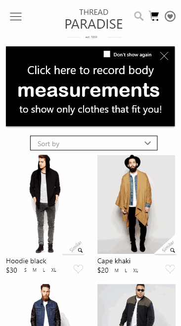
On the homepage, there is a box that encourages users to save their measurements so that the app shows only clothes that fit them. If the user choose not to do so, he can press the 'Don't remind again' checkbox and close the panel. If he chooses to record his measurements, he will be brought through a series of pages to record his size. Each page is used to record just one measurement so as to minimise the clutter and confusion to users. In each page, there is a '?' icon to guide users to measure the respective body part accurately.
In each product details page, there is a button that leads to the size guide. This size guide has a zoom-in function to help users focus on different parts of the sizing table. Again, there is a figure to guide users on the proper measurement technique. In addition, there is a short text under 'Recommendation for you' that shows up if the user recorded his measurements. This short auto-generated text informs the user what size he should buy based on his measurements and what people of similar body sizes says about the fit.
Product details
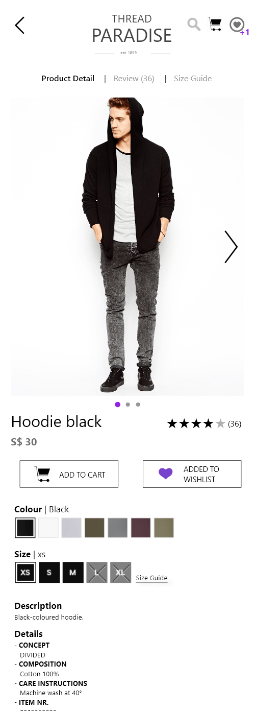
A 'similar item' button is added to each product image. When the user wishes to find clothes similar to the selected item, he presses the button and goes to a new page where items similar to the item selected are shown. To increase the visibility of reviews and size guide, we utilise a three-tab layout, where users can access the Product Detail, Reviews and Size Guide without scrolling at all. The product images are displayed on a swipeable carousel. Although there is already a review tab, we want to bring back the star rating system that is familiar to many of our target users, hence we are showing the number of reviews on two sections of the screen.
User reviews
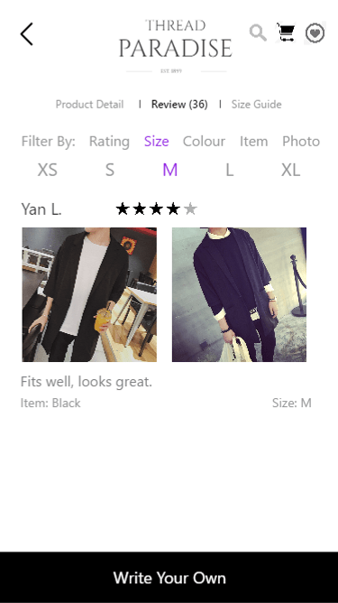
The reviews in existing eCommerce apps can be quite irrelevant to users, or at times, number less than 10 due to the lack of incentive to review. We introduce filters to the review system so that users can find relevant reviews. For example, the user wishes to buy the M size shirt but he doesn't know whether he should buy it. He might want to press the Filter by Size to show only reviews of people who bought M size shirts. There is a button at the bottom of the review page to facilitate quick reviews.
Comparison tool
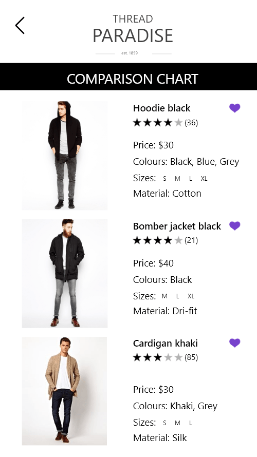
The comparison tool is integrated into the wishlist page. Within the page, users can select a number of items to compare.