SUTD Graduation Night
Period
May to Sep 16
Role
Co-director (Publicity),
Logo Design,
Website Design,
Award Nomination ArtProject Scope
Implement a series of publicity materials to boost participation for the graduation night gathering.
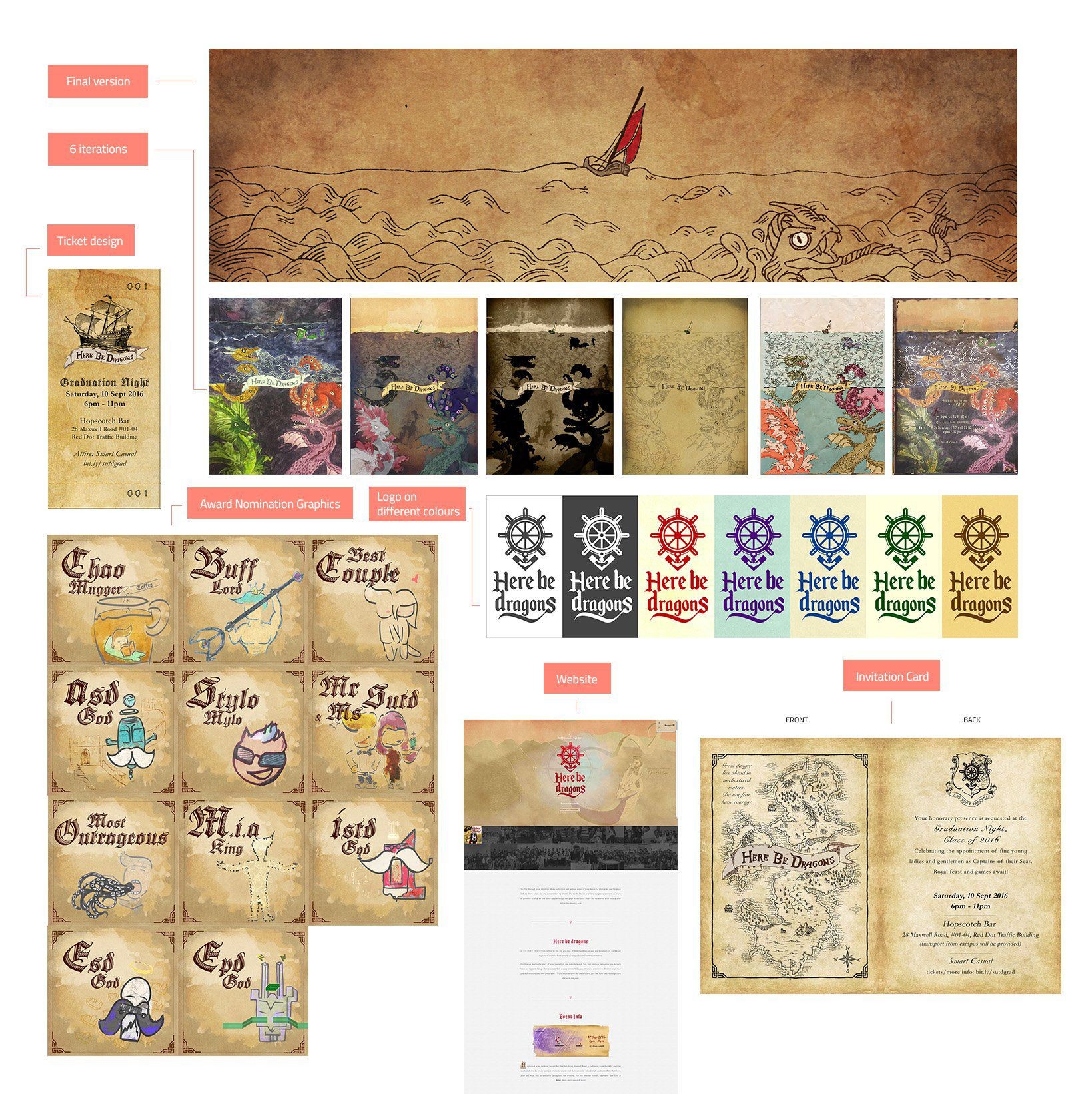
About Grad Night & Deliverables
Initiated by the Alumni of Singapore University of Technology and Design (SUTD) and planned by a student committee, the SUTD Graduation Night is an annual celebratory night for graduating students. There were ~250 seniors from the graduating batch and the aim of our publicity team, consisting of 7 members, was to attract as many people as possible to the event. After discussion, we decided to produce the following materials:
- Event Logo Design
- Poster Design
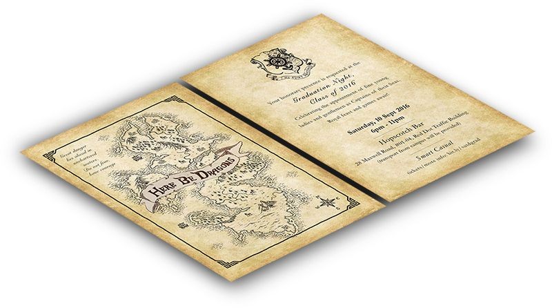
- Invitation Card Design
- Event Ticket Design
- Award Nomination Graphics
- Website Design
Brainstorm
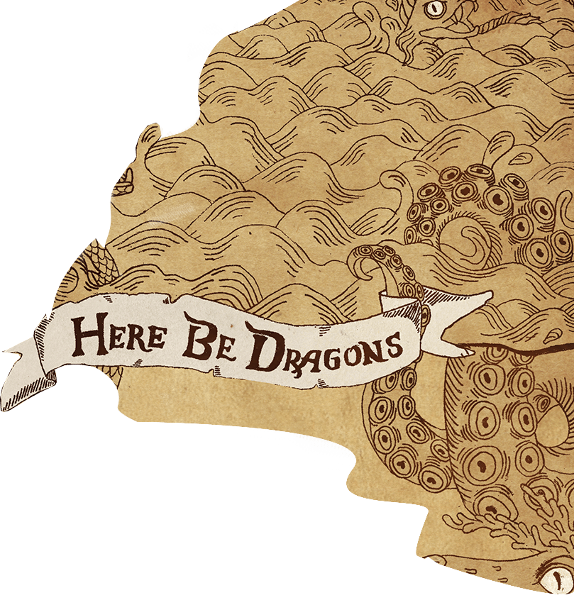
Many themes were brought up during discussion. One of the feedback from the previous year was the selection of the theme, "Into the wild", which didn't resonate as well with the graduating seniors as was intended. We wanted to come up with a theme that grabs their attention because its immediately relevant to them. One of the better ideas was a theme on the "1990's", referring the decade our seniors were born into. We were able to come up with decoration and the general feeling of the theme, but we decided to change it to "Here be dragons" to better suit the dark, medieval feel of the event location.
Styling and Plan
"Here be dragons" is a medieval theme. It refers to the old practice of drawing dragons and sea monsters on uncharted regions of maps to warn people of danger beyond known territories. We sourced for decorative, medieval-looking serif fonts and set a colour guide with brownish tones. To kickstart the publicity, we decided to release the posters with the invitation cards. This would be followed by video trailers, email notifications and the website. For backend work such as event booklet design and ticket design, we had a flexible timeline to work with.
The logo we came up with is made up of three parts: the steering wheel of the ship, the anchor and an arrow pointing downwards. The arrow down symbol refers to the "here" of "here be dragons", the anchor refers to the "heaviness" of the responsibility our graduants have, and the steering wheel represents the control they have over the journey they choose.
We started the campaign by delivering ~250 invitation cards to every senior student in the graduating batch through the level representatives. People seldom receive cards anymore. A physical card would hopefully build up some form of fuzzy feeling, the kind one gets from being invited to an exclusive event. To add to the hand-crafted human touch, each of the name on the 250 cards was handwritten by Pauline and affixed with a wax seal on real wax (Yes, real wax!). The seal was custom made in China using the logo I designed previously. The clouds of smoke inhalation from wax burning was quite an experience. Not too awful, not pleasant either.
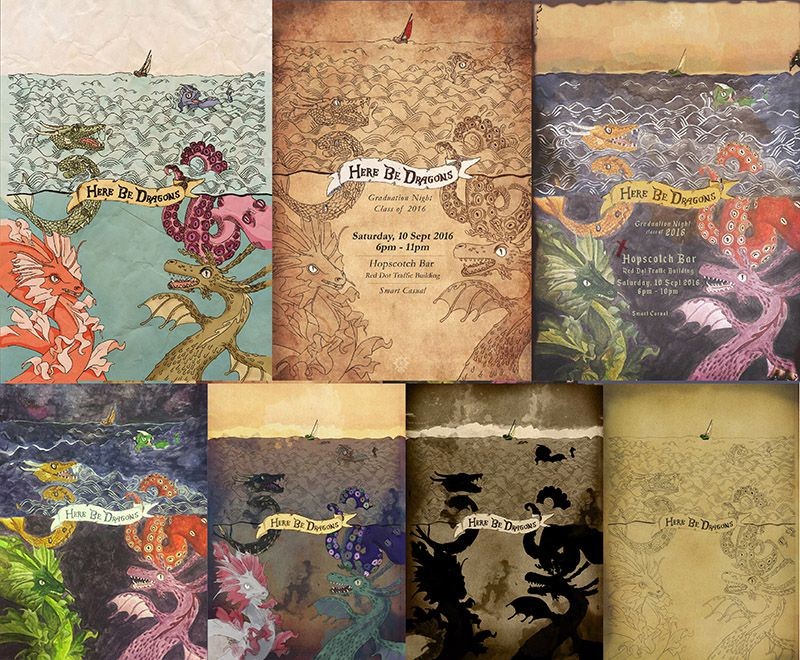
On the same day we distributed the invitation cards, we put up the poster over the school too. Illustrated by llustrated by Inez, the poster started out with a sketch. We did colouring experimentations and decided on Inez's version as it fitted the event theme better: the feeling of rough seas was well conveyed. I wonder if it's because of the burned scrolls effect linked strongly to pirates and seas. Not to mention the lack of colours used by human dwellers on seas on paper. Our colour setups:
Website
We required a platform for (1) purchasing of tickets, (2) title nominations, (3) message dedication, (4) submission of photographs, and (5) to post official updates of the event. We came up with a vertical-scroll website with the aid of patterns and specially-created graphics to enhance the theme feel of the website. Jotform and Google Forms were used for ticket purchase and message dedication. Dropbox was used for submission of photographs. After submission. the photographs get pulled to Flickr using IFTTT, which then gets pulled to the site gallery using Flickr's API. Website has been archived to Github Pages as domain (sutdgradnight.com) as expired. Visit the website
Afterthoughts
Even though the colour palette and fonts used were pretty much uniform in all the materials we produced, they didn't looked as uniform as I hoped. For example, our dragons in the (1) header background of the website and (2) the poster were created by different artists within the team and had different styles. The ships in (1) the poster and (2) the event ticket had different styles to them too. The graphics created for the nominations were more cartoon-like than the other graphics.